ANIMALS FOR PENS - How the images of animals have been used to advertise fountain pens.

Publicity creators of the past often found a powerful source of inspiration in the world of animals, exploiting this realm of images and logical association to create refined and sophisticated advertising messages.
Feathered animals, such as ducks, pelicans, eagles, blackbirds, swans, etc. represent without doubt, one of the most expressive and symbolic scenarios to be connected to the world of fountain pens, due to the deep relationship between feathers and the history of writing.
Antique dip pens, which needed to be dipped continuously into ink, evolved into fountain pens, which are finally self sufficient, self filling and free to write as long as the ink they contain lasts.
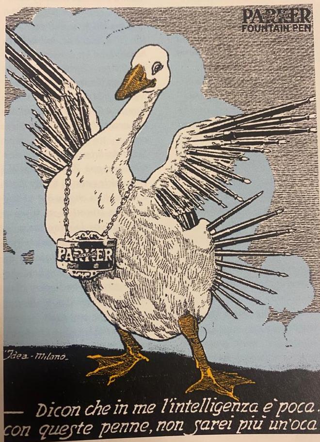
The world of ducks and geese in these early years is therefore mostly used to illustrate the connection between tradition and technical developments; they sort of guarantee the reliability of the new writing instrument.
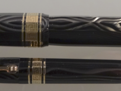
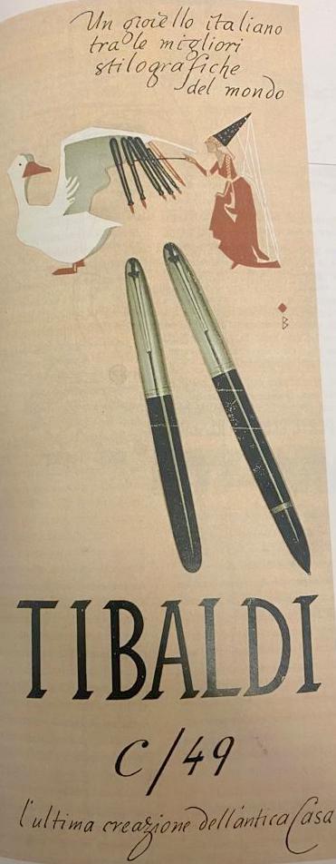
This exact principle applies to the “ magic goose” we find in one of Tibaldi’s ads of the 1950’s. The fairy, holding the magic wand, transforms feathers into fountain pens. This simple image is enough to express the idea of the passage from the quill to the modern fountain pen. The goose and the fairy guarantee that the new instrument is not only reliable but also contains a bit of “magic”.
Birds embody the connection with tradition, but they can do a lot more.
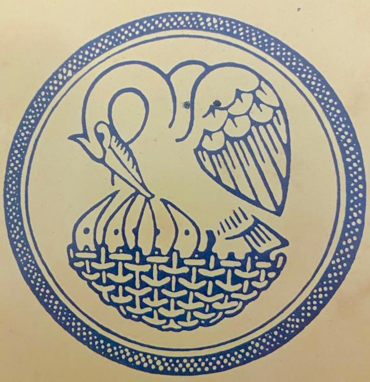
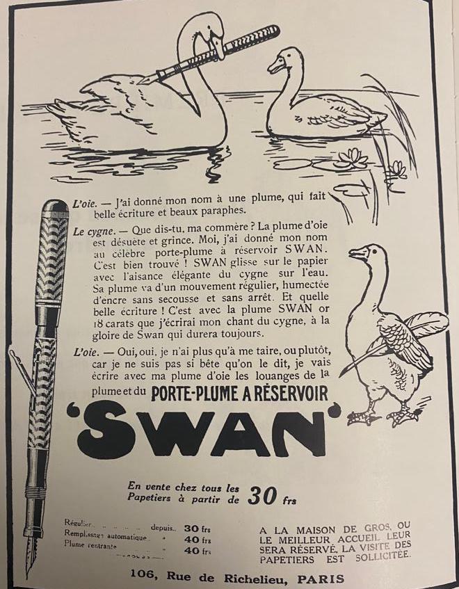
They can for instance graciously and elegantly glide on water. And here we have the smart Mabie Todd swan, whose elegance is the physical expression not only of flexibility and smoothness but also of the aesthetic style of the pens which bear its name.
A single image can express beauty, smoothness, lightness and ink- tightness. The swan gives its name to Mabie Todd’s pens and its image becomes the company’s symbol, with a unique evocative power, which doesn’t even need words.
In one of Mabie Todd’s ads, there is a dialogue between a goose and a swan, which is meant to underline the technical evolution from the old-fashioned quill and the modern fountain pen. The swan says: “ what are you talking about my friend, the quill is old and out of date. I have given my name to the Swan fountain pen and I am glad I did! The Swan pen glides over the paper with the lightness and elegance of a swan on the surface of water. The nib has a regular movement which is constantly fed with the correct amount of ink and never trembles”.
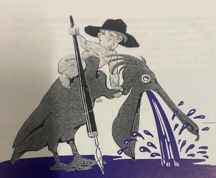
The role and meaning of Pelikan’s pelican bird is totally different.
The German Company was originally an ink factory and at the beginning used the image of the bird with its huge tank-like beak as its trademark. The pelican bird rigurgitates ink into the ink bottle with a very strong evocative impact. The powerful and generous bird remains as company logo even later when the company enters the market of fountain pens, generating chicks which are lovingly fed by the mother pelican. The baby pelicans in the stylized nest of Pelikan’s trademark represent fountain pens, which are meant to develop and find their way in the world of writing instruments. The association of ideas is logical, simple and very efficient.
The British company De La Rue likes the pelican, too. It adopts the bird with the large beak as the symbol for its Pelican model exploiting once more the evocative power of this large bird connecting it to the large ink capacity of the pens..
Birds do fly.
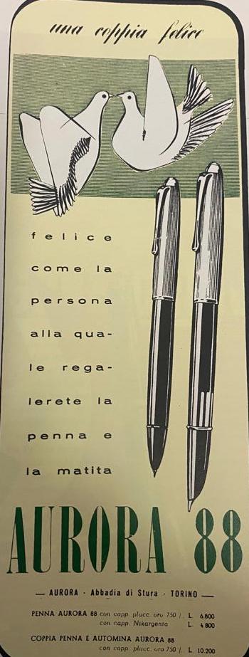
A few of them have a light and elegant style of flying, others express instead power and strength. Aurora uses light and elegant doves for the ads of its Aurora 88.
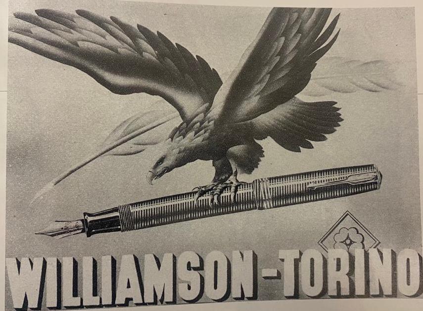
Other pen companies prefer instead the strength and power of eagles; the Eagle Pencil company uses and eagle which imperiously flies over the earth, clinging a pen in its claws as if it was a precious prey.
The eagle is the protagonist of the ads published by the Italian Williamson company, too. In its ads, the mighty bird flies with a fierce expression over the world with a pen solidly clung in its claws. Here the message is even subtler as the idea of possession is clearly emphasized as if the fountain pen was a precious writing instrument which deserves to be held tightly in one’s hands.
The blackbird is one of the most common birds, it is likeable and well known; this is why Mabie Todd chose it to name one of their new models. The blackbird is small, light and lovely: the same is true for the pen bearing its name. Mabie Todd’s Blackbird has all the necessary requirements to be a reliable, low-priced, successful writing instrument. The same model was also sold in Belgium with the name “Le Merle Blanc”.
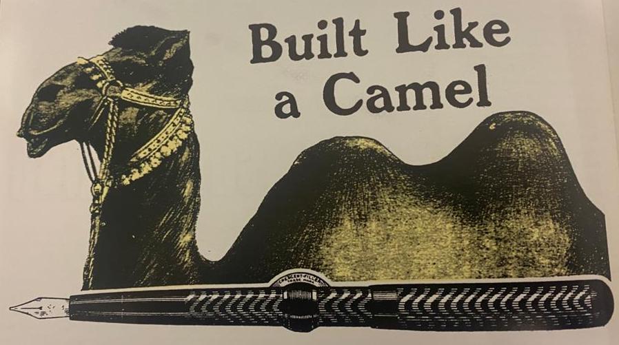
To depict ink capacity, Conklin developed the idea which associated the outline of its Crescent Filler to the hump of a camel. The advertising result is efficient and totally original. The camel embodies all the qualities you can expect from a quality pen: it moves smoothly covering long distances, its capacious hump allows it to live long without water in the same way as the Conklin Crescent Filler can write very smoothy and do without the ink bottle for a very long time.
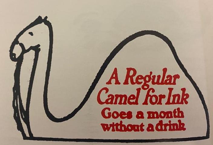
A few years later, the American Dunn company came up with the image of the camel once more, to emphasize the great ink capacity of their pens which were able to write for “ a month without a drink”. It’s a shame that the graphics depicted a dromedary instead of a camel, as we can see in the ad.
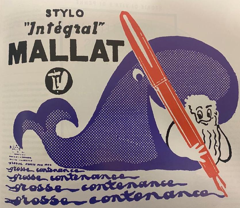
The French company Mallat chose the whale; the size of this animal was used to underline the enormous ink capacity of its pens. The cetacean’s happy smile is a symbol of friendship and, being a marine mammal, there is no doubt that the pens it advertises, are water/ink tight.
Parker in the late 1920’s decided to choose the natural contrast of colors of the tanager bird (red body and black wings) to support its advertising campaign for the Duofold, a big red pen with black ends.
Montblanc is one of the few pen companies which very rarely used animals to promote its products. The image of a bear was used to name one of its sub-brands: “Schwarzer Bear”. In this case the powerful animal becomes the symbol of sturdiness and strength. Another Montblanc sub-brand, the Reflex, was associated with the image of a cat, underlining softness of touch and flexibility. Beyond this, Montblanc’s advertising campaigns have used lots of other iconic images with no connection with the world of animals.
It is finally worth mentioning the tortoise: in Japan, the word Mannenhitsu, used to identify fountain pens, derives exactly from the association with the name of this animal, which is the symbol of long life. Tortoises are in face very common in many old Japanese pen adverts.
The journey in the world of animal-related pen adverts cannot be considered concluded without mentioning the Italian brand Leoncini, which utilized the image of a monkey writing with a huge fountain pen. In this case, more than suggesting ink-tightness, reliability and smoothness, the image suggests that with a Leoncini fountain pen, even a monkey can write!
This article was written in 1996 and published in the Italian Pen Magazine "Vivi il Grande Mondo della Penna" nr. 17.
Most of the illustrations come from the original publication.